Re-Reading Mary Farl Powers
The original catalogue from Mary Farl Powers’ posthumous exhibition at IMMA in 1995 has been digitised and is now available to read below. The re-publication of this book, which contains rare writings on Powers’ work, coincides with the current display of a selection of her works from the IMMA Collection in the exhibition A Fiction Close to Reality (running until 14 October 2019). You can download the pdf here or read the introduction and essays below.
The catalogue, now many years out of print, features two essays written by the late artist’s sister, the writer Katherine A. Powers and art critic Aidan Dunne on the occasion of her 1995 solo exhibition. In different ways, both writers provide thoughtful and intriguing insight into her life and work and augment her legacy as one of the most influential printmakers in Ireland. An introductory foreword by curator of the exhibition Brenda McParland reinforces the importance of her work to IMMA. In 2009, the Powers family generously donated over 50 works by Mary to the IMMA Collection, a selection of these are currently on display until 14 October 2019.
Irish Museum of Modern Art
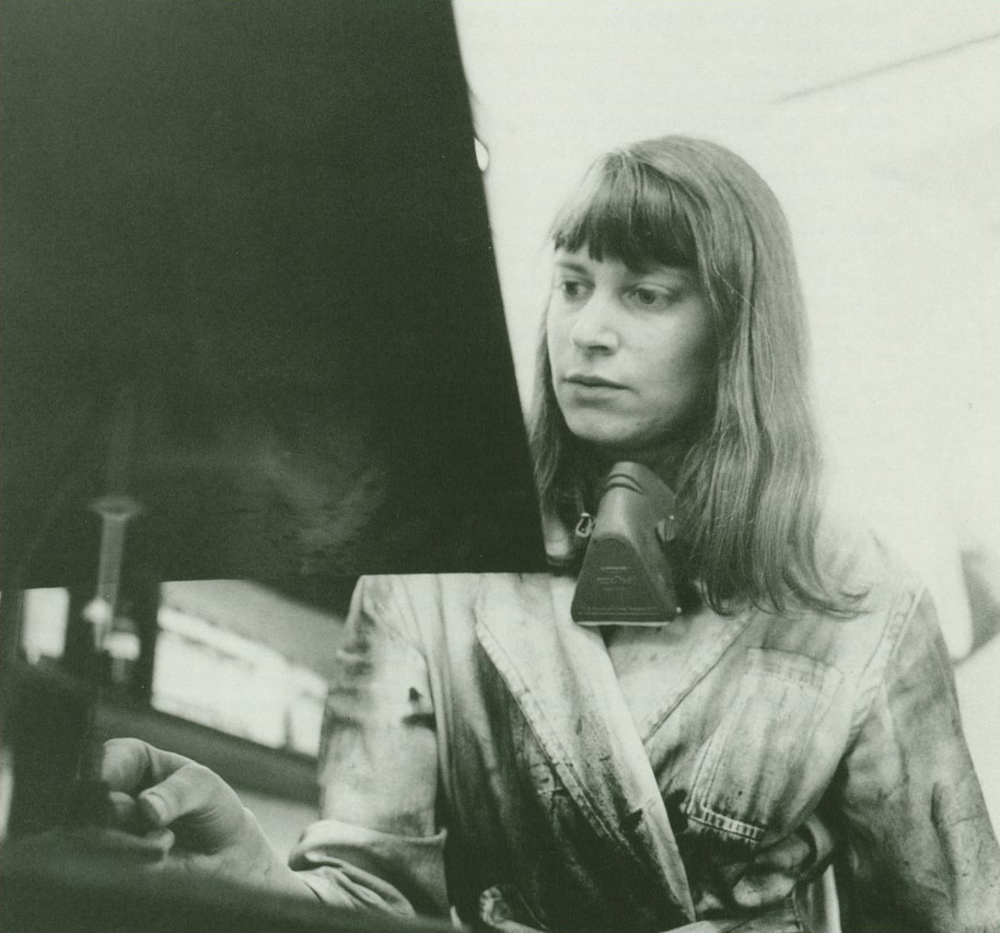
Mary Farl Powers (1948-1992)
‘In Search of Order’ – A Retrospective Exhibition, 1995
Foreword by Brenda McFarland
This first retrospective exhibition of the work of the influential printmaker Mary Farl Powers continues IMMA’s policy of presenting major retrospectives of Irish and international 20th century artists alongside contemporary exhibitions and projects.
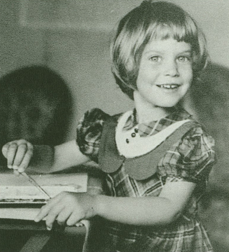
Mary Farl Powers was born in 1948 in Minnesota, USA, the oldest daughter of a family of five. Her father (from Illinois) and mother (from Minnesota) were both writers and came to Ireland for the first time in the early 50s. They lived a bohemian life moving every few years with their family back and forth between Ireland (Greystones and Dalkey) and the USA.
In May 1975 Mary Farl Powers’ parents decided to return to the USA to settle, continuing their writing careers. At this point when the rest of her family were returning to the USA, Mary decided to stay as she was just beginning to gain recognition for her work in Ireland. Mary Farl Powers lived and worked in Dublin for the rest of her life. As an artist she made a major contribution to printmaking in Ireland, in particular through the Graphic Studio, Dublin where she worked from 1973.
The exhibition In Search of Order is a retrospective which deals with work from 1971 (the artist’s first print) to 1991. The exhibition includes some surprising, early works which have not been seen before, as well as some later works which will be familiar to an Irish audience. “In Search of Order” is the title of a late work made in 1991. Aidan Dunne titled his essay after this work and it seemed appropriate to use the same title for the exhibition, since it emphasises a more open exploration of the artist’s practice and ideas than a conclusive statement.
The exhibition explores moments of shift in Powers’ practice as a ground breaking printmaker in terms of her subject matter and printmaking techniques. Powers was prolific and innovative – she made lithographs, etchings, woodblock prints, she made her own cast paper works with watercolour, torn paper works and sculptural forms – continually expanding and questioning the language of printmaking.
IMMA is indebted to The Mary Farl Powers Estate for making the work available for the exhibition and to individual family members for their great assistance, especially Jane Powers for her research and involvement with the exhibition, and Hugh Powers for the photography of works. Special thanks to Katherine A. Powers and Aidan Dunne for their interesting essays on the artist and her work for the catalogue. IMMA is also grateful to all the lenders to the exhibition.
A substantial body of work representing all aspects of Mary Farl Powers’ career will stay at IMMA on long term loan following the exhibition. This body of work will provide a valuable addition and rich resource to the Museum’s Collection, and we look forward to showing it regularly at IMMA and in galleries throughout Ireland in the future.
Brenda McParland, Curator: Head of Exhibitions, Irish Museum of Modern Art.
‘Mary Farl Powers’ by Katherine A. Powers
Mary Farl Powers was born beside the Mississippi River in St Cloud, Minnesota a year after I was. She had a huge mouth, enormous eyes, a bad temper and an astonishing number of phobias. Among the things she dreaded were worms, caterpillars, eggs, electricity, gas explosions, tornadoes, food-caulked forks, rabies and doctors. The force of her personality was so great, however, that she invested her fears with a powerful moral valence: one couldn’t help feeling in her presence that only an unprincipled person, a conniving slacker, would accept such abominations complacently. Aside from this unnerving trait, she seemed to me exotic and remote, and later she became enigmatically generous.
I hadn’t the slightest idea what she was really up to during the time I lived with – her or for much of the time I corresponded with her. It wasn’t until very late in the day that I saw the shape of her life and that she had, in fact, devoted it to becoming and being an artist. And it is only now, as I reread the many letters she wrote to me years ago, that I see how undeviating her path was.
Above all, she made a clear distinction between working for a living – taking jobs, that is – and working as part of one’s life. She was utterly opposed to the former and adjured me to steer clear of it when I returned to the United States in 1972. “If you did work in America,” she counselled, “you might become less introverted, in that you would have a little groove to fit into. But the people who would be your pals would be … like my boss who came to Ireland, with his travelling clothes and his beery breath. They would like you, and want to buy you beef burgers and torpedoes and discuss politics with you, and communism.”
Regardless, I persisted in my plans for lowly employment, and quickly felt the lash of her pen: “For God’s sake do not take a job selling donuts at night or anytime. Are you mad? You think you’re unhappy now, just wait and see how you feel if you do that. It seems that you have a streak of servility in you …. When I worked I hated every instant of it. I despised the people, the work, the social security card …. I hated my job so much that I quit one week early, with no money, but 74 cents a day to live on and no place to live.”
“My problem, as always, is money,” she wrote later, “and being unprepared to go out and get a job …. I have to be doing my work to be content…”
Her opposition to jobs, of course, lay less in their being a waste of time, but, as is clear from the above, in the sort of company they throw one into. Mary was most emphatically not a man of the people, and the people she was least attracted to were what might be referred to as generic men: the boyos and fine fellas. She was, of course, partial to individual men. But that part of the male circuitry that governs the mass of them, that generates pomposity, flatulence and bluster inspired in her fascinated revulsion. Men, she pointed out, routinely add two inches to their height.
The work of art that expresses this best, “A Real Fighter,” is so awful to look at that it does not even appear in this exhibition. She described it as she was working on it in 1974, as “a rather super little number … in stereophonic colours, very small, of a man with his domain behind him, the green hills and all.” There he is, with his big chest stuck out, his great pear-shaped head, close-set eyes and prissy mouth. It is loathsome and shows what a good thing it was that Mary turned away from representational art to express herself.
It is instructive to compare this frightful thing with her 1977 Christmas card etching, “Three Kings Resting.” These are good boys, their manly little heads affixed to abstract sleeping bags. No doubt when they climb out in the morning the usual rumpus and pomp will begin, but, for the moment, a touching order reigns. This calm is not unlike the serenity of the unbreached egg.
The egg, as it happens, aroused the strongest emotions m Mary. She was disgusted by the inner slime, the white gaggy bit, the baleful yolk and its nictitating membrane-to say nothing of the threat of some bloody surprise. Nonetheless, or perhaps as a consequence, she was fond of egg shells, their austere restraint. Similarly, she found babies dismaying, their copious and miscellaneous evacuations and their general aura of worminess. Still, she was pleased with them when they had their shells on, so to speak, when all their arrangements were well wrapped and battened down.
She was, in sum, horrified and fascinated by the teeming innards of things: “I made a chicken which looked like a frog last Sunday,” she reported in 1972. “I was very frightened of it, and its lungs and other goodies which remained stuck to its inside dashboard. But I persevered and it tasted quite nice, as by that time I had forgotten my vow to become a vegetarian. Although that condition is not so safe either. I believe there are worms in the carrots. I saw one about 3 months ago, and our newly purchased carrots have the appearance of being slightly wormy, but I will not look, because I don’t want to know. I had always thought that carrots were free from that blight.”
“Also I had 2 radishes last night. Everyone else had some too and they warned me that they were hollow, but only after I had taken a bite cutting the radish neatly into 2 parts, one in the mouth, one in the hand. I looked down at the piece in the hand and saw a brown hollow, just like the home of some worm or so. I spat out the half which was in my mouth immediately. Luckily I had not begun to chew it much. I didn’t examine the wreckage, but just pushed the plate away, and took a clean one. I felt bad all evening.”
The truth is that, rather than being reduced by what she feared, that is, creeping, slithering, bulging or exploding things, each frisson of horror or disgust provided another nuance to her view of the world. She mastered them in her art. She took them down a peg, disciplined their rampant naturalness, their deliquescent menace and held them in check, etching them into a semblance of order.
Life in damp and troubled Ireland provided her with a surfeit of material. When she and her friend Ruth Riddick moved into a new flat in 1975 an archetypal scene ensued. “Ruth began to paint my bedroom to be,” she began. “I removed the miscellaneous floor coverings and found it: the rising damp they call it. In fact it is a most loathsome fungus. One corner in particular was flourishing. It was white and fuzzy and formed like the roots of a tree. Oh gag.
“Ruth stopped painting. I removed more floor covering wearing rubber gloves and prodding with a chisel. The rest of the floor was covered with black mould. The landlady was summoned from her perfect house above. She pretended there was nothing very wrong with it. She said the room had not been aired, but she would get her handyman down the next day while he was still fresh, and he would scrub the floor. The floor has never dried, and he washed it two weeks ago, and the weather has been warm. The mould is back but fresh and strangely attractive …
“After I had painted the room I discovered the live wood worm. And the beetles which, from a distance (which I kept), looked like miniature horned toads. It was the proverbial last straw. The fungus I could tolerate, the moths I killed, the spiders I ignored or Hoovered up, the centipede in the bath nearly finished me but I washed it down the drain, the strangely flattened mouse in the courtyard I put in the bin despite the fly that was crawling all over it, the grass growing from the floor of the kitchen surprised me but didn’t alarm, and the funny smell in the bathroom I was prepared to put up with so long as it remained invisible. But the wood worm sent me off again to the landlady …
“She later told Ruth that I was rude about the wood worm. She wants me to leave. She says ‘We can’t have her down there by herself, she might have a fit if she sees a spider.”‘
The congeniality of Ireland to a person such as Mary who drew inspiration from chaos, if only to tame it, is perfectly obvious- though, to be sure, it had its pernicious aspects as well. “My exhibition has happened,” she wrote to me in June, 1974, “and it was not a roarin success as far as sales were concerned. The exhibition was good in itself though I think. Selling-wise it was beset by disaster, what with the bus strike (now in its sixth glorious week), the torrential downpour the night of the opening, and the accompanying traffic jams, and the bombs, which exploded a week after the exhibition opened. I was in Grogan’s (the Castle) when they exploded and naturally was afraid to leave; and if I had, I couldn’t have got to the train in time because one of the bombs exploded along Trinity’s green railings en route to the train. And the bus strike was on then too. Eventually I got a taxi home. It was pretty nasty. Now I have become resigned to being blown up, and that makes things better.”
Because of this, I guess, she was able to move to Belfast for a time. About it she wrote, “Belfast is fine. I was frightened a bit at first. Luckily the indiscriminate bombing seems to be on the decline. There are fewer soldiers around also. But it can be upsetting coming across them with their great guns pointing at you.”
The force that drove Mary’s work was her fascination with, and her perverse visceral attraction to what alarmed or offended her. She wanted to take the snail by the horns, to slip a hand into the perilous, primeval ooze. “Last night,” she wrote in 1986, “James O’Nolan and myself printed another colour on my new lithograph. I don’t know how good it’s going to be. There are another 3 (I think) colours to go. It has red in it so it may please you.
“You may recall in the olden days when Mama said we could make mud pies someday. Well, that promise was now made over 30 years ago and yet we never did get to. My latest prints are an effort to rectify that situation. This present lithograph is done with the hands, covered in lithographic ink, which looks like ‘black slime ‘. And I am experimenting with smears in the etchings, applied to the plate with a mixture of titanium white printing ink, soap, oil and water. These smears are not the colour of mud, but the consistency is pretty good. The plate is then etched, and can be printed in any colour, say like jam colour smeared on a door knob.” [May 7, 1986]
Life on earth will always spawn its jammy door knobs. The great pity is that one who so appreciated their provocative qualities left it far sooner than she should have.
Katherine A. Powers is a writer and lives and works in New York.
‘In Search of Order’ by Aidan Dunne
In his novel Anna Karenina, Tolstoy describes how, every two months or so, Anna’s lover Vronsky sets aside a day to put the clutter of his life in order. “Every man,” Tolstoy writes, “who knows to the minutest details all the complexity of the conditions surrounding him, cannot help imagining that the complexity of these conditions, and the difficulty of making them clear, is something exceptional and personal, peculiar to himself, and never supposes that others are surrounded by just as complicated an array of personal affairs as himself.”
Similarly, Rainer Maria Rilke’s image of life as a perpetual struggle against chaos that eventually engulfs us reads almost as a translation, into the lives of humans, of the second law of thermodynamics, famously – or notoriously – applied to human history and society by the American writer Henry Adams. Adams is largely responsible for the second law’s extraordinary popularity with many 20th century American writers. Closer to home, there is W .B. Yeats’ apocalyptic vision of inevitable, entropic decline.
The second law states that disorder will always increase in a closed system. But the implications are perhaps more vividly illustrated in a popular, fairly grim paraphrase covering all three laws: you can’t win, you can’t break even and you can’t get out of the game.
The sense of an enfolding chaos, and the instinct to create order in the face of chaos, are perhaps the dominant features of the work of Mary Farl Powers, just as they were significant traits of her character and her approach to life. The hallmark of her style throughout a relatively brief career (about twenty productive years) is her remarkable technical proficiency, a proficiency that to some extent colours her attitude to her subjects and, to a debatable extent, influences the form of her prints. But she is much more than a gifted technician. There is a considered and developed view of the world implicit in her work throughout her career, and for most of the time it is the dominant force in determining its form.
She could reasonably be described as an abstract artist, and did in fact describe herself as such in the simplest possible terms. In 1989, when she was asked to make a self-portrait for the NIHE’s National Self-Portrait Collection, she was asked what personal significance the undertaking had for her. It was, she replied in writing, the only portrait of any kind she had made in her adult life. “I am not,” she elaborated, “an artist who represents things, jam jars, buildings, people. These things already exist, so I don’t want to depict them.”
Yet a glance back through her output suggests a success10n of what might be described as representational hints, and sometimes much more than hints. Certainly, even when eschewing representation as such, she maintains close links, of a metaphorical, symbolic sort, with the universe of things.
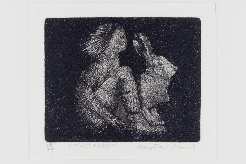
A brief inventory of recognisable motifs might go something like this. Most commonly, her work is related to landscape, sometimes quite specifically, sometimes in an abstract or metaphysical sense, as if she is invoking the idea of landscape as part of a thought experiment. Then there is the human presence. After the early work, it is treated in an extremely stylised, abstracted manner, but it is certainly there, chiefly in the form of the many Torso etchings.
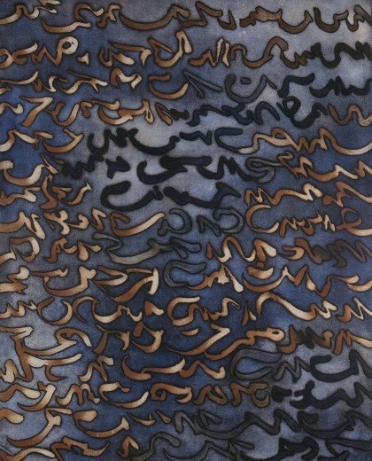
There is an entire series based on beans of various kinds. Many of these, again, have human connotations, as do the majority of the Ribbon etchings, which in turn overlap with the Torsos and recall elements of Islamic calligraphy with their swooping, elegant forms. In fact you could represent a sizeable chunk of Powers’ work in terms of a Venn diagram with three intersecting circles labelled Torso, Bean, and Ribbon. Then there are moths, which provide a basic structural pattern for many of the later pieces.
On the face of it, that amounts to a considerable amount of notionally representational content, and there is more. But Powers is all the same quite consistent when she describes herself in writing as an abstract artist. In general she doesn’t treat this material in conventionally representational ways. She is not much interested in how things look in a certain light, for example, or in the picturesque aspects of landscape. Abstract considerations always underpin her use of imagery. “I don’t create an image of a thing,” as she puts it, “but, I hope, a thing in itself.”
Some critics of her work, while praising her technical excellence, bemoaned the fact that she had nothing to say with it. Yet it is precisely what she chooses not to say that defines what she is about. Sometimes she seems to filter out virtually every element of representational content, leaving, for example, just a terse dialogue between light and dark or positive and negative. Often you feel that she creates an equilibrium that in a sense nullifies the visible content of an etching. There is an element of black humour in this notion of art as a jig danced at the edge of nothingness.
These seem to be the kind of ideas that consistently engage her in the etchings, but a preoccupation with extremely abstract ideas does not necessarily entail an exclusive involvement with printmaking technique. In just the same way that particle physics seems to ignore the real world of human experience but actually deals in a level of reality that encompasses that world, her seemingly dispassionate technical exercises are fired by a profound interest in things around her. They may be abstract but they are by no means remote.
To get the most out of her work, it must be approached with these concerns in mind. If we come to it looking for representational vignettes, for explorations of figurative imagery, we are bound to be disappointed. That is not what it offers us. There are, though, relevant fragments of personal narrative and external guides to interpreting her imagery.
The landscape that underlies so much of that imagery is an abstraction in itself. In all likelihood, however, it is also rooted, mentally and physically, in the vast undulating prairies of Minnesota, where she was born and spent much of her childhood. Though rich in iron deposits and forests, mainly in the northern regions of the state, and though it boasts an extraordinary number of lakes, Minnesota is primarily classic Midwestern terrain: big open farming land under wheat, corn and oats, a place of climactic extremes, prey to harsh, cold winters, hot summers and invasions of insects.
“It can hit a hundred and five in July,” one inhabitant of the northern part of the state comments in Blue Highways by William Least Heat-Moon, “and forty-five below in January. One hundred and fifty degrees of temperature is how we keep the riffraff out. When that doesn’t do it, then it’s up to the mosquitoes and the leeches.”
In the notes she made for a talk she gave in the National Gallery, Powers refers to her “concern with order and chaos,” seeing it as dating from her early Minnesota years, even citing an early traumatic experience, an encounter with a horde of army worms when she was five years old, reminiscent of something out of Alfred Hitchcock’s sinister eco-fable, ‘The Birds’.
She quotes the eye-witness testimony of a farmer from a local newspaper: “Go into the field at night. That’s when you really see them. It’s just as though the field was alive with them.” She goes on to mention invasions of grasshoppers, cutworms, sawflies, mayfly, a plague of frogs and deluges of gigantic hail ” … at least that’s not alive.”
She sets the order and clarity of the Minnesotans’ way of life as a necessary bulwark against this vision of invasive natural chaos. “To me the world was a dangerous place, a ghastly contrast to the sterility and safety of the formica kitchen. Order needs to be imposed to protect one from this fearsome place.”
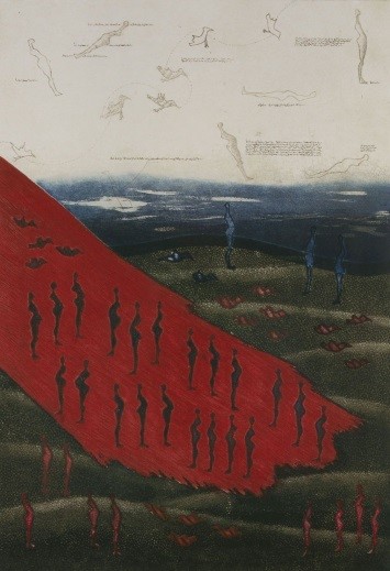
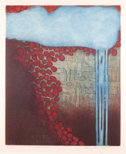
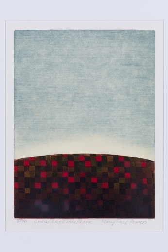
In one strange etching, ‘The Plan’ (1975), a grid of human (perhaps pregnant women) and animal (dogs) figures is superimposed over a landscape – perhaps even falling onto it like hail – symbolically colonising, populating and domesticating it. In ‘Chequered Landscape’ (l 977) a clear blue sky vaults over a curved horizon line and the earth below is squared off in shades of red. In what is in many ways a pendant to this piece from the same year, ‘Seascape’ offers just as elemental a composition, except that the order on the sea is curvilinear rather than right-angled.
‘Emblements’ (1981), with its reference to cultivation, its calligraphic rows of forms laid over an amorphous ground, quite comparable if technically and conceptually far superior to ‘The Plan’, might present cultivation as a figurative writing on the land, another imposition of order. ‘Scarp’ and ‘Esker'(1981) refer to specific geophysical phenomena. They share the idea of an orderly formation read into unruly natural processes, and they establish a metaphorical connection between the means of their making and the natural processes of deposition and erosion in the landscape. The bravura give and take of their surfaces suggests the natural interchange of materials.
In this they typify Powers’ structural language with its basic balance of order and chaos, the precise mark set against the amorphous form. It is true that the dominant feeling from most of her work is one of control. Everything about those impeccable surfaces seems calculated: lines honed to razor sharpness, abrupt plunges from light to dark and back again, fine mists of delicate tone, seamless detail.
Yet she also embraces the disorder that she regards so fearfully: “Elements of both chaos and order are apparent in my work”. This is evident in her attitude to the forms that she creates and. develops through a process of accelerated natural selection. “Each completed work has evolved from various components in much the same way as different forms of life evolve.”
Faced with a blank etching plate, she begins with a fairly tight set of options. There is a range of marks that are contingently her own, including the ribbon, the bean, torso, the moth, the landscape. They have a personal significance for her that relates to experience. And there is a range of strategic approaches. These include the idea of symmetry – “such a good idea, and so successful, as can be seen by its extensive use in nature”.
There is also an extension of symmetry in several variations on the concept of balance. Many etchings work on the basis that every form must have its anti-form, just as in nature every particle has its anti-particle. Positive balances, and entails, negative, a principle frequently employed in the etchings.
But an important starting point as well (and, as she matures, more and more an important element from start to finish) is the use of chance, chance within certain parameters, admittedly, to some extent controlled, but still chance, given increasingly free rein. When she uses watercolour on her cast paper pieces, it is with the conscious knowledge that her control over the process is strictly limited. Hence the symmetries of the Moth forms are, while implied, actually broken when given material presence in paper and pigment.
Again, she doesn’t so much rehearse as play with the ideas of symmetry and broken symmetry. In a specialised sense the latter has featured prominently in theoretical physics for quite some time, and Powers might almost begin many pieces with a basic philosophical enquiry from a physical perspective: why is there something rather than nothing? Something, for her, might commence with the breaking of a given symmetry.
Nor is order an unequivocally positive force. Part of the domestic order that, in the event, she rebelled against was the strict Catholicism of her parents. The opposite, equally strict rationality suggested by her rigorous application of technical procedures and her own (evolutionary) observations about how she developed her language of form entail a tacit acceptance of the random, uncontrollable play of natural forces.
At some stage in the 1970s she acquired a microscope and began to examine beans of various kinds with it. The etchings inspired by her studies of soya, kidney, black, mung, pin to and other beans easily convey her sense of wonder at the unexpected richness that becomes evident with magnification. And more besides. In them the bean is revealed as an extraordinary object. But the more closely its surface is described the less tangibly real it seems. It is as if it dissolves at the point of contact. Its slick skin becomes a window.
Clearly her discovery of this well-nigh invisible world interests her because it offers her not only the curiously pregnant, ambiguous forms of the beans themselves, a set of organic shapes that she can use in a non-representational way, but also the worlds within worlds revealed by the microscope. Both aspects she exploits to the full.
In J.G. Farrell’s novel The Singapore Grip, a sympathetically portrayed young girl labours under the delusion that an American visitor is describing himself as a “human bean”, and constructs an elaborate theory as to what this might be. Similarly, one strand of Powers’ long series of etchings that come under the heading Torsos are, in many respects, human beans. She anthropomorphises the biomorphic shape of the bean (perhaps a kidney bean), so that we can read it as a stylised – very stylised – torso, as in the prize-winning ‘Torso’ (1975).
These appear in tandem with a series of Ribbon torsos, largely arising from a remarkable set of studies of the phallus she made around 1975. In these, male genitals, belly and thigh are indicated in just a few fast, calligraphic lines. The works are unusual, both because they are, for Powers, specifically figurative and because graphic representations of the penis were (and for that matter are still) not that common. They were made for a group exhibition on the theme of the male nude at the Project Arts Centre, Dublin. Some of the press comment centred on the well-tried, specious argument that while female nudes are beautiful male nudes are not, an argument challenged by Powers’ elegant phallic studies.
The free-flowing line that quickly becomes one of the staples of her style, with distinct overtones both of Zen spontaneity and Islamic calligraphy, seems to have originated in these (for her) relatively rough works. She goes on to refine it considerably, combining its terrific kinetic energy with increasing degrees of precision and startling spatial effects, sometimes using an elaborate low-relief technique. In terms of their spatial play, some of these etchings are reminiscent of computer-generated three dimensional images, figure-ground illusions in which (generally banal) objects gradually resolve themselves out of backgrounds of usually abstract, finely woven pattern.
The technical complexities of a work like ‘Gold Ribbon’ (1977) are literally breath-taking. The motif, with oblique figurative connotations, floats buoyantly against a tangled ground of fluid, interlocking pattern. Prodigies of methodical effort are devoted to persuading us of the sheer lightness, the complete insubstantiality of the ribbon image, which floats like a feather. This is a recurrent feature. In 1980 she remarked to journalist Elgy Gillespie that she felt etching was close to sculpture in terms of the sheer physical work involved. Time and again this investment of labour is devoted to erasing evidence of its history by means of the casual, transitory appearance of the finished work. Painstakingly devised, fabulously detailed background patterns are given only the slightest physical embodiment. Foreground subjects seem to have drifted momentarily into the frame and might, one feels, as easily drift out again.
Often the ribbon-line falls onto or around the contours of male and female torsos. As with the incredibly polished surfaces of the bean-torsos, which seem alternately like solid objects and windows, much play is made of the illusive nature of what we are seeing, as in ‘Red Torso’ (1977) or ‘Cloud Torso II’ (c.1979), with its strange, nascent imagery. Outside becomes inside, large becomes small, and vice versa.
Sometimes, as with the more overtly abstract work, it seems the intention is to persuade us that nothing is actually there, a tendency that becomes more marked as time goes by.
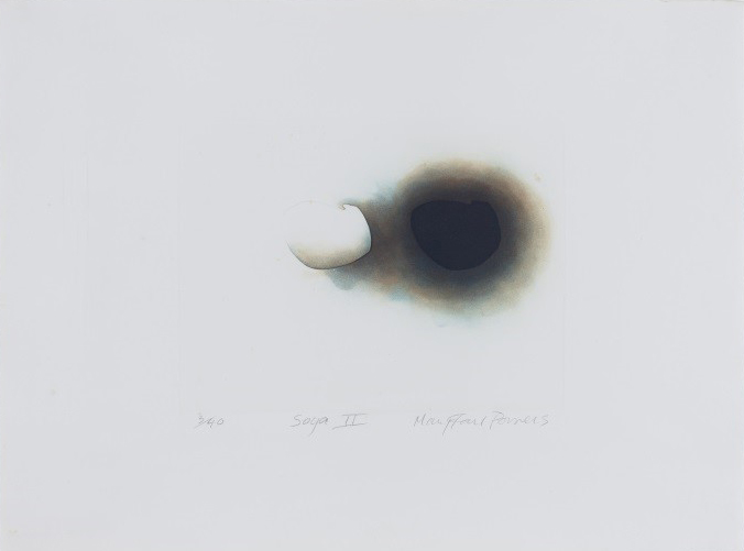
By 1981, in ‘Soya I’, Powers can, with just an embossed outline and a few tonal washes, consummately blur the line between somethingness and nothingness. ‘Soya II’, true to its title, features two beans Gust as there are three in number three in the series), but it is also effectively an image of bean and anti-bean, and of course they cancel each other out. ‘Hinge’ is a variation on the same theme, noting a symmetry between positive and negative. ‘Sprout’ introduces a new dimension – time – into the equation.
Here an open-ended vertical line of growth is juxtaposed with a scattering of beans. The line, however, turns back on itself in a series of loop works based on or featuring the Mobius strip, a flat, continuous surface looped back on itself to form a figure of eight. Though it’s peculiarly appropriate to her vision, she first used the Mobius strip in etchings made for a group exhibition on James Joyce. ‘Vico Road I and II’ (1982) refer to “Joyce’s interest in the philosopher Vico, and the idea of a circular universe.”
In the 1980s Powers made her most audacious move towards harnessing the forces of disorder when she uses a new motif, the moth, and, while continuing to make etchings, a new technique, cast paper. The implication of audacity may not be immediately obvious. After, all, the moth is archetypically symmetrical and hence emblematic of a fundamental ordering tendency in nature. However, it also represents something quite negative for her. “I admire the elegant symmetry utilised by the moth, but I am, (or was)” she notes, “terrified of moths themselves. Making these objects (her cast-paper sculptures), which were related to a dangerous animal (as I saw it) held an element of excitement (and risk).”
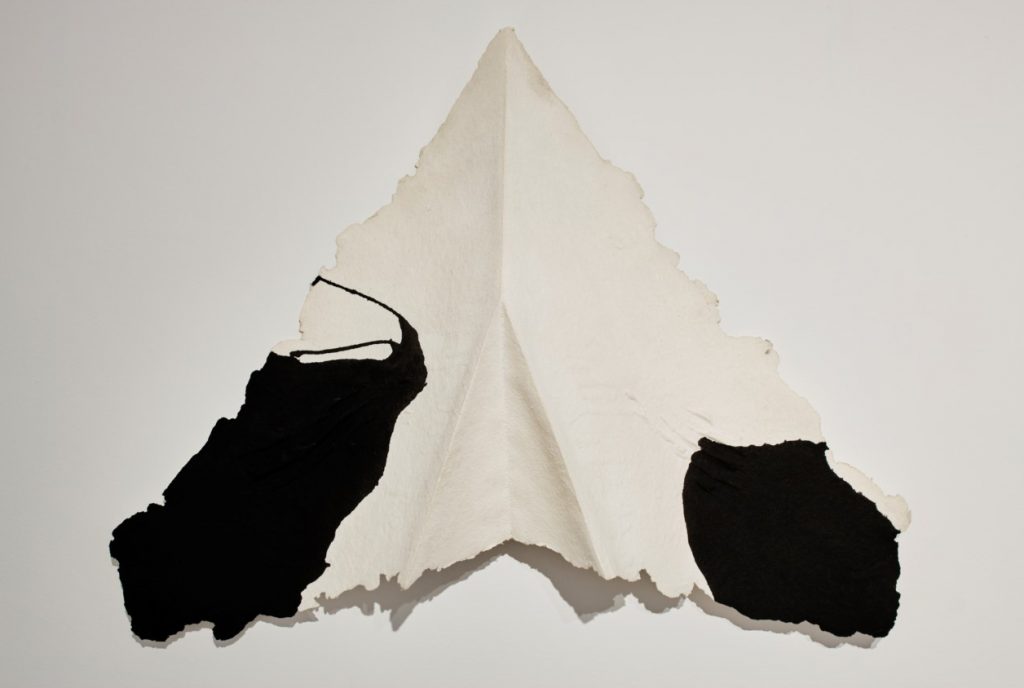
Her images of moths, furthermore, are not the lepidopterist’s delight you might expect, not the exercises in layered precision she might have made in the 1970s. In fact she feeds tremendous uncertainties into the images because of the way she chooses to make them, especially when she uses cast paper, prompted, she whimsically remarks, by “an unfulfilled childhood desire to make mud pies.” While the pulp is malleable, it invariably dries to an uneven texture and, because it is dense and unsized, it responds unpredictably to the introduction of watercolour, which soaks in freely and deeply. The kind of exactitude typical of the mid-1970s work is out of the question.
The low relief of the etchings gives way, as well, to the almost sculptural bas relief of the moth forms, though they are still mounted like prints or paintings. They do, though, lead on to sculptures per se: the extraordinary giant moths of cut and folded paper with watercolour markings. Here the basic language remains true to Powers’ long-time methodology, with the order of a definite symmetry played off against the workings of chance. Yet things are not quite the same. Often Miro comes to mind in relation to the later, woodblock or watercolour and cast paper works, with their calm acceptance of the limits of control, their autonomous abstract forms and their quality of playfulness, as in the revealingly titled ‘In Search of Order'(1991). The folded paper works, together with a set of laminated paper sculptural panels dating from the mid-1980s, forsake the illusionistic realm of the etcher’s plate for an exposed, perilous, three-dimensional existence. They are much more open and contingent both in the forms they adopt and in the way they are made.
Later is of course a relative term, and Powers was still comparatively young when she died. She should have had many more years of productive activity ahead of her, and the span of her career is actually very brief. What is most surprising is the way, in the space of a couple of decades, she learns to incorporate in her creative vision so much of what was foreign, even frightening to her. If at first her dreams of order lead her into Escher-like complexities, troubled by demons of disorder, she is in the end at least on nodding terms with those demons, and more than able to accommodate them in her imaginative world.
Aidan Dunne is a writer and critic who lives and works in Dublin.
Note: All quotations from Mary Farl Powers are taken from the artist’s unpublished writings. The quotation from ‘Anna Karenina ‘ is taken from Constance Garnett’s 1901 translation. William Least Heat-Moon’s ‘Blue Highways: A journey into America’ is published by Secker & Warburg and by Picador.
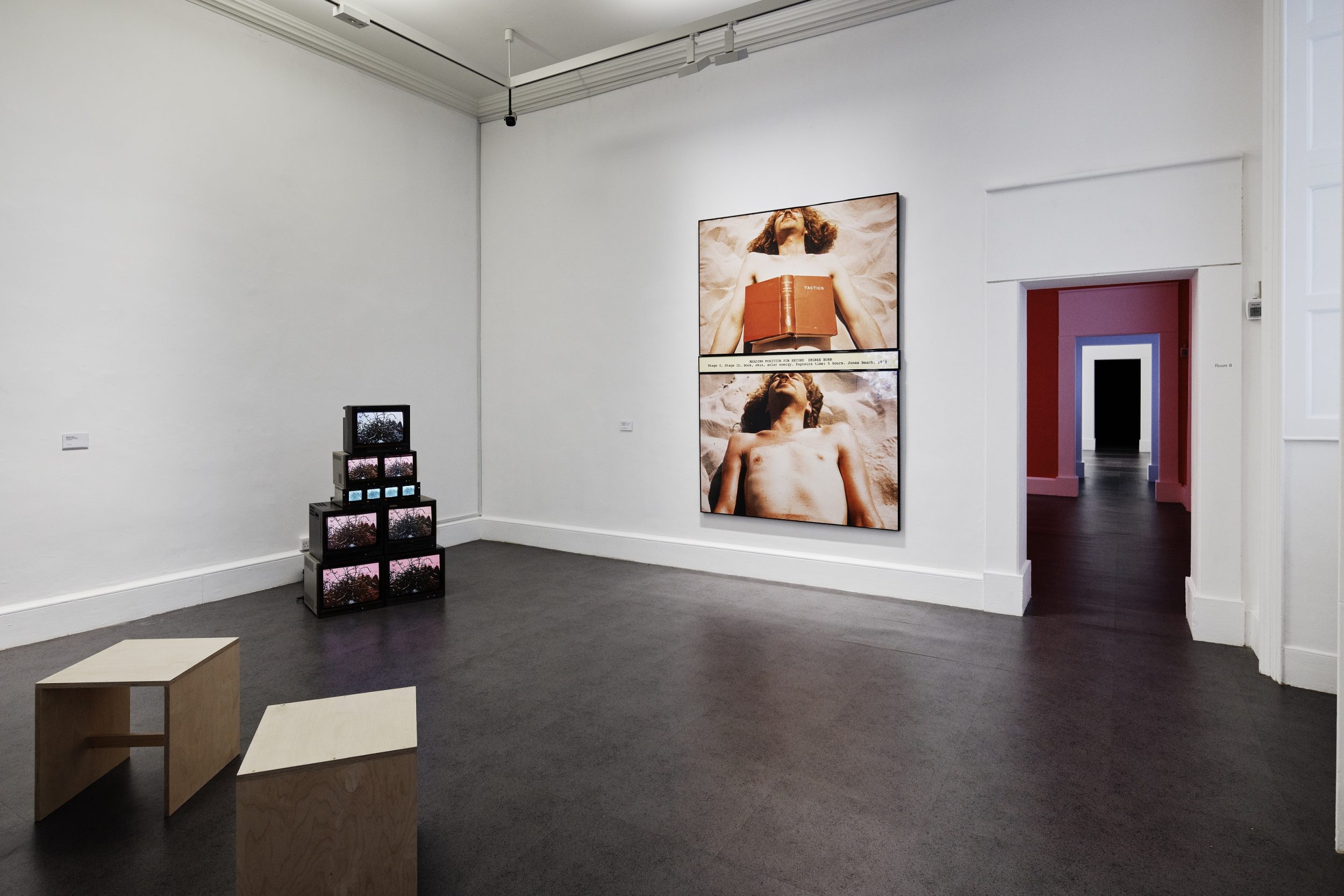
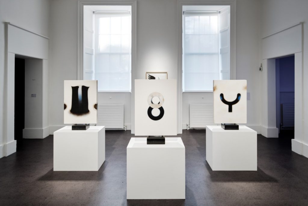
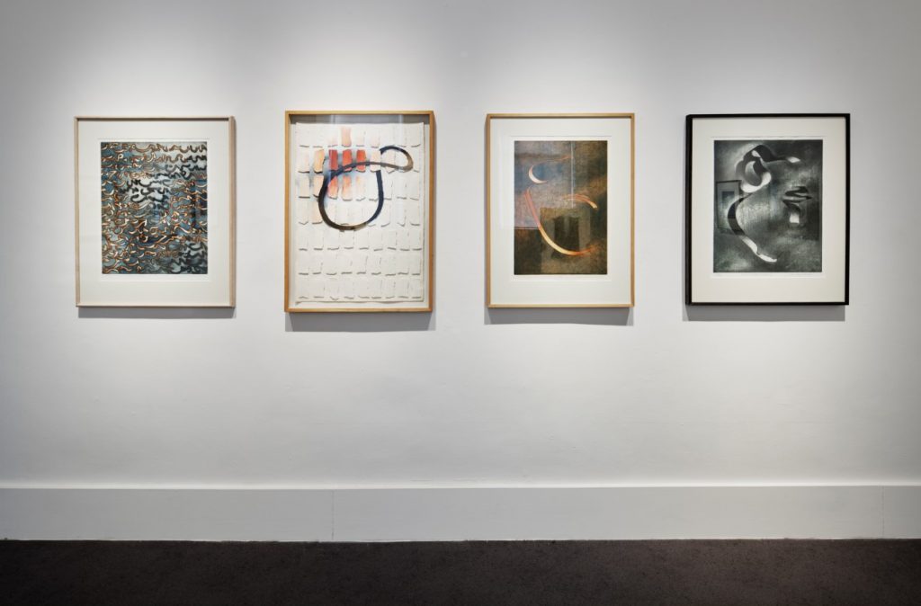
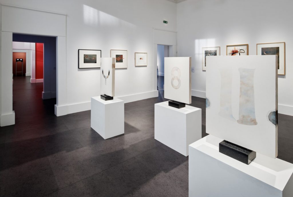
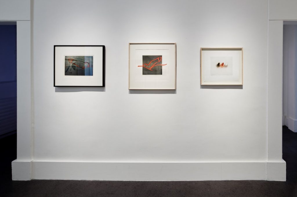
Installation images from current exhibition at IMMA:
Categories
Up Next
Poet Chiamaka Enyi-Amadi responds to IMMA Collection exhibition
Wed Aug 28th, 2019