Alan Phelan on ‘Fragments’

As the IMMA Collection show ‘Fragments’ enters its final weeks, artist Alan Phelan reflects on his involvement in the layout of the exhibition.
Fragments between subjects, objects, histories and house plants
I became involved in Fragments after the Collections curators Christina Kennedy and Marguerite O’Molloy came to my place to discuss the installation arrangements for my film Include Me Out of the partisans manifesto.
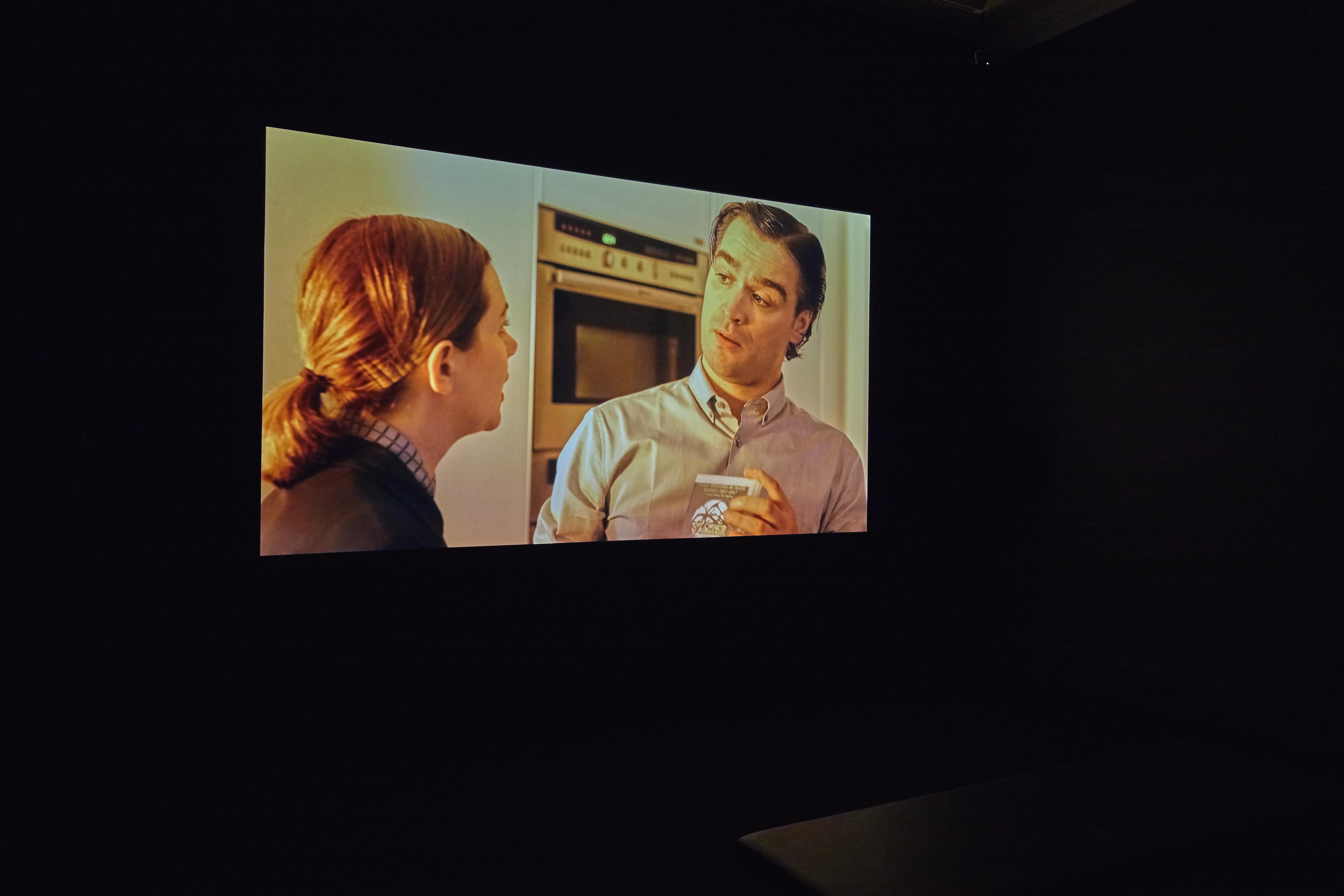
We discussed possible rooms, light-lock designs, adjacent works, exhibition flow and sections. In the subsequent weeks Marguerite asked me to get a little more involved, as I seemed a little too keen to know what was where in the show. I was asking too many questions.
Marguerite had made an initial selection of about 37 works that were to be hung in the main corridor space gallery. These works mainly came from the Gordon Lambert Collection and were chosen in response to the Gerda Frömel retrospective and Karla Black exhibitions, as many were from a similar era or style as Frömel, and others dealt with materiality linking to Karla Black.
Originally many of these were hung in Lambert’s home, and in the early days of IMMA Marguerite had visited several times and remembered how they were positioned, but moreover the special and sometimes unusual contexts and juxtapositions that occur in a home. One story that struck a chord was of the Bird of Paradise flower that Lambert often had in a vase beside the Deborah Brown Glass Fibre Form (1971), which has an orange section that the flower compliments. When I was asked to suggest a possible layout and design, I began here – thinking about how to reference the domestic settings without turning the gallery into an extended living room installation.
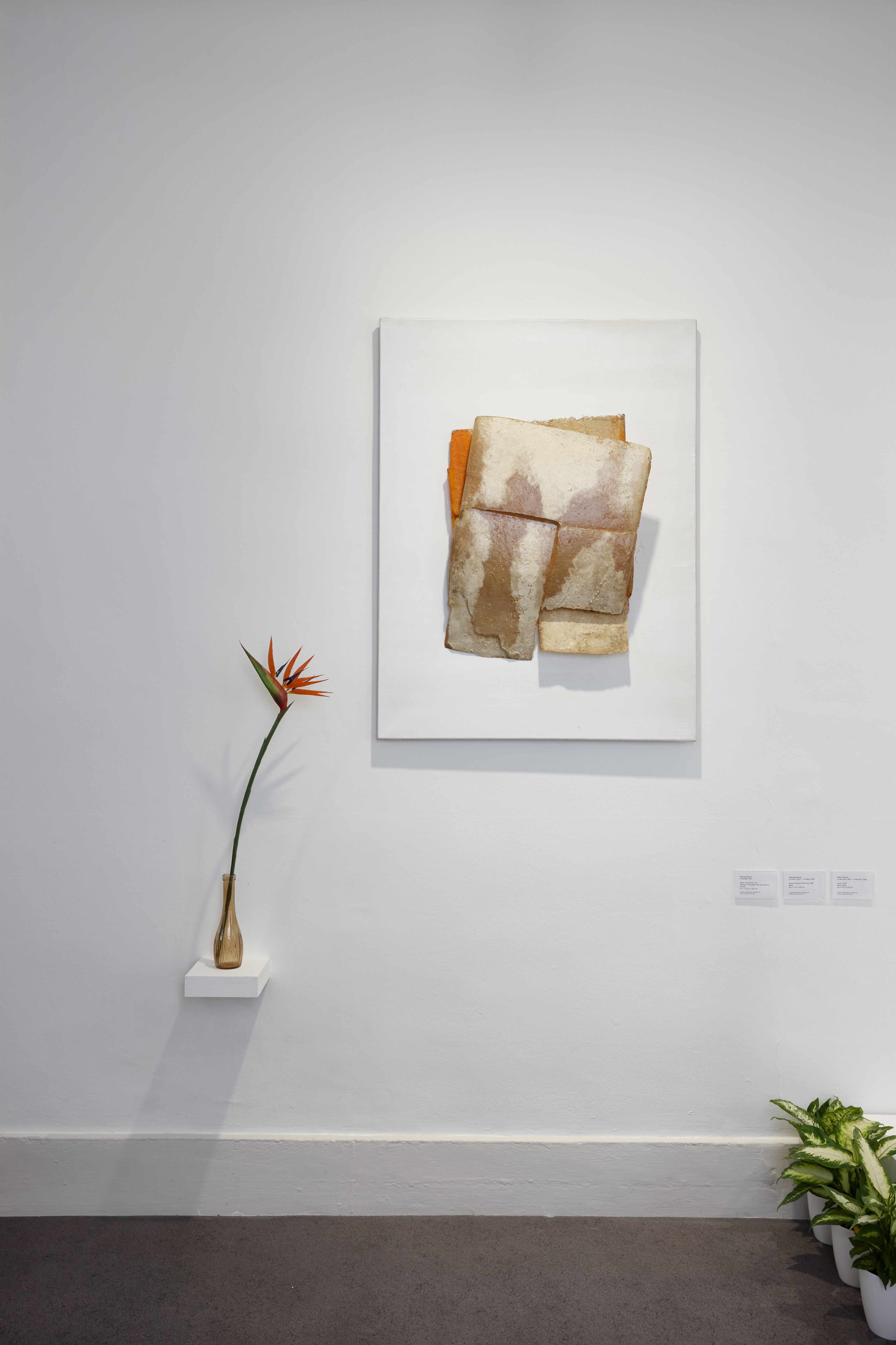
I recalled how a few decades ago museums and galleries used to fill in vacant gallery space with large house plants like palms and ferns (like these installation shots from the Walker Art Center, Minneapolis).
With the greater sensitivity in recent times for installation, this convention became less favourable as everything in a gallery became part of “the work”. I thought it would be interesting to revisit this tactic, but as a way to draw a diverse collection of artworks together. My other suggestion was to break another convention of responding to content and favour a more modernist trope of form, but specifically materials.
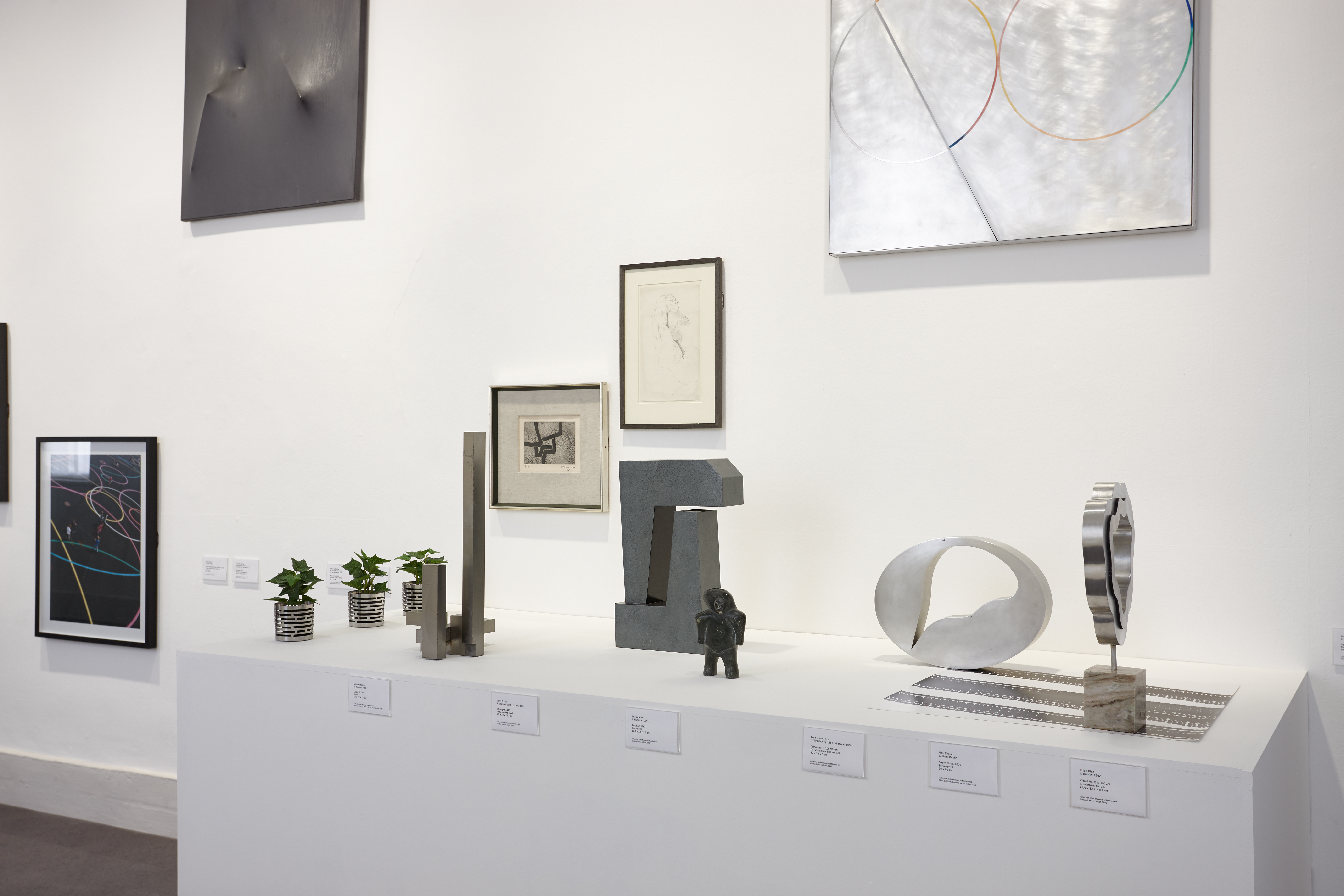
Oddly enough, grouping sculptures by metal type and wood provided a fantastic initial breakdown which made the wall pieces easier to position. 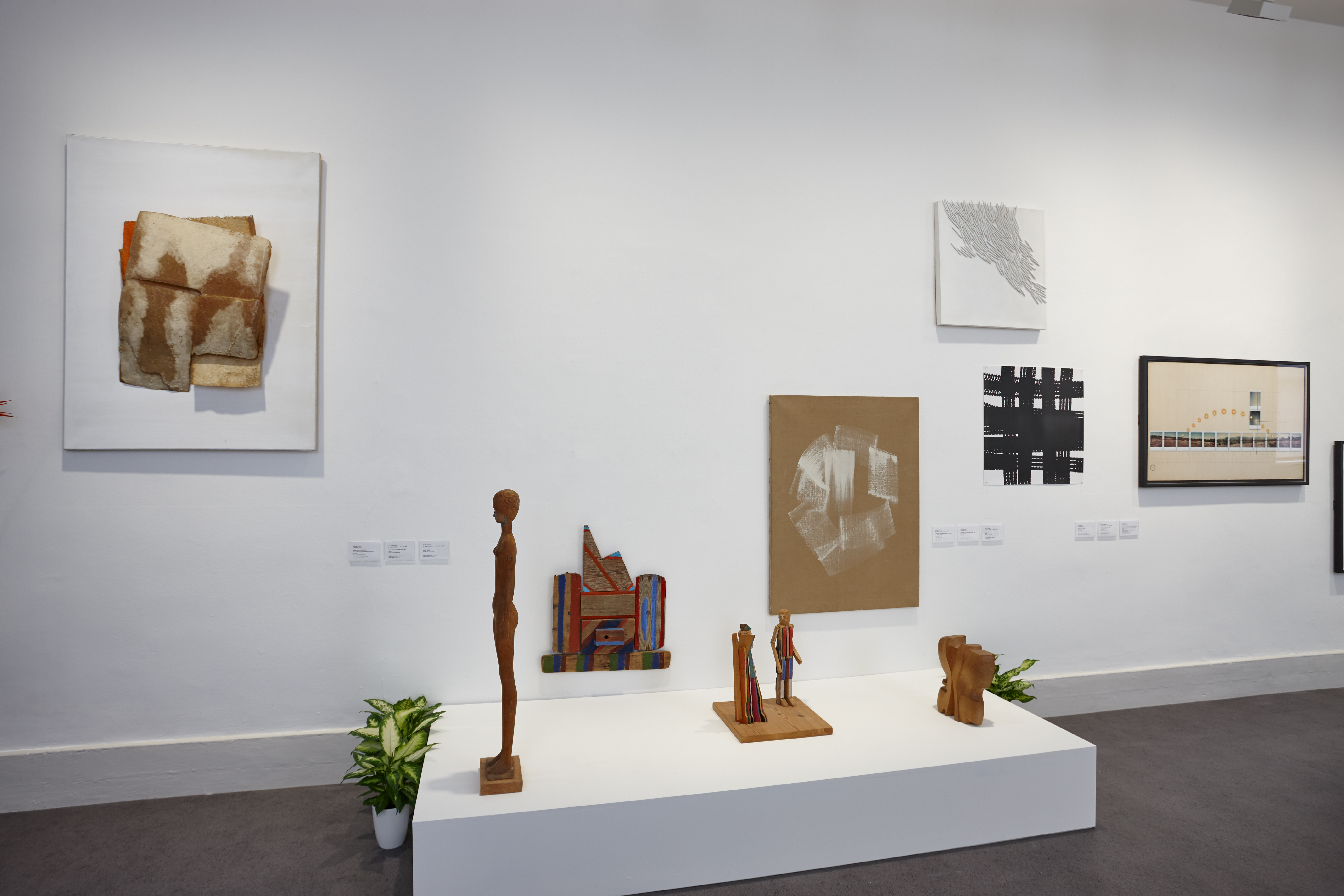 Marguerite colluded with this process by adding and subtracting various pieces. What was exciting for me was then making further suggestions for the other works in the gallery; I placed a Brian O’Doherty felt-tip drawing beside Kathy Prendergast’s denim fabric sculpture Stack; as well as breaking up the grouping of smaller Kenneth Hall paintings, placing the small ones near my film installation and the larger opposite Aleana Egan’s wall sculpture The sky looks down on as many things as the ceiling.
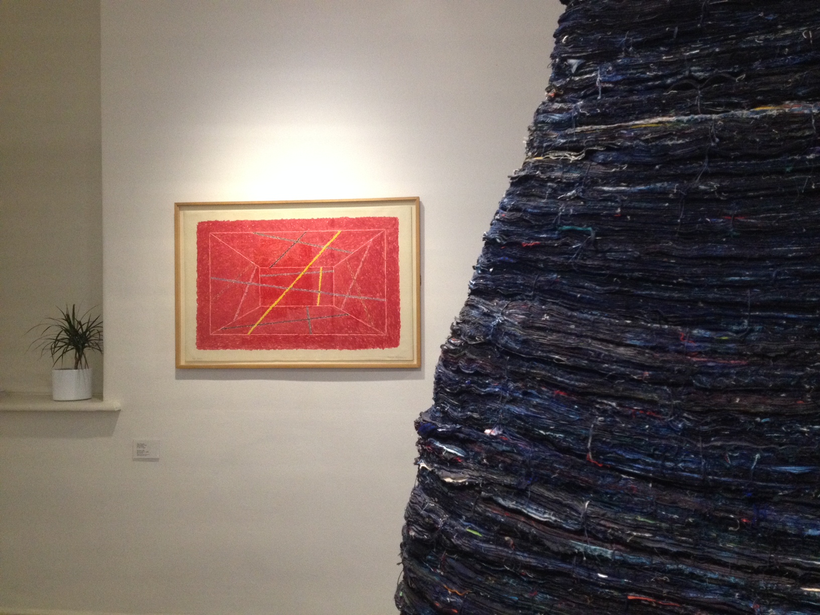
Colours matched but the juxtaposition of the works opened up a dialogue across generations, enhancing each other brilliantly.
This repeated, in some ways, a lesson learned hanging a photography show at the George Eastman House in Rochester New York while on my post-graduate work experience. I had the task of hanging a Stephen Shore exhibition that was a typical mix of street and landscape images.
I was advised to follow tonality and forget about the content. This worked so well. Narratives emerged from the hang in so many unexpected ways and gave a visual consistency to over 100 framed works.
My intervention or collaboration with Marguerite fell into more regular territory with my request to use an image of a Picasso’s painting Deux Femmes courant sur la plage (La course), 1922, which is referenced in the last few lines of my film. I thought the addition of two photo murals would help shift the black box setting a little. Getting permission to use a Picasso image is no simple task however. There is a large machine taking care of all things Picasso, but eventually Marguerite found the right size at the right price to use. I love the way the image, bare, flat, and oversized, hidden in the light-lock connects to the gilded Kenneth Hall outside and also to the photo mural of the “Partisans”.
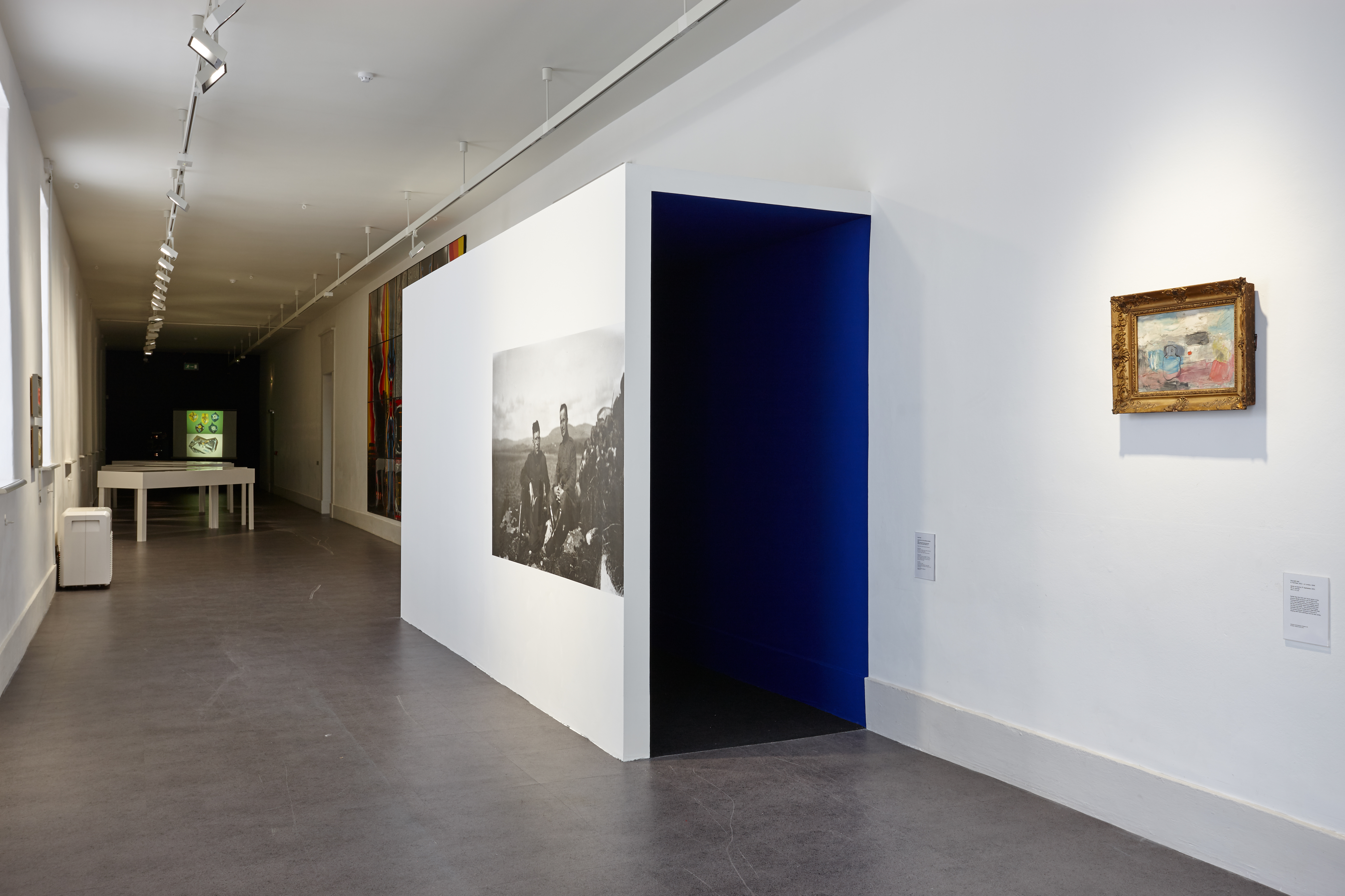
These extra characters function to broaden the understanding of the film, to expand the narrative beyond the couple arguing about the destruction of their DVD collection. Then, in the final hours of the hang, we were looking at the wall pieces and realised a figurative work was needed to balance both sides of the gallery and the mix of works. Marguerite remembered there was a Picasso etching in the storage on site and ran off to fetch it and rapidly complete the paperwork. This swift response countered beautifully the torture of getting the other Picasso which had taken several months. The piece slotted into the arrangement perfectly, rounding off a really good mix of figurative and abstract pieces.
The reaction to Fragments has been mainly really positive. Many of my peers have complimented the hang, but some visitors more familiar with the works have not liked the positioning and indeed all the house plants. My response was rooted in the need to refresh the works by honouring their past but negotiating the present. Artists have been making interventions in museum collections for many years now and ‘institutional critique’, which was so dynamic and radical in the 1990s, is now commonplace within many museums. Artists are now part of the fabric of museum exhibition making with the curator no longer the gatekeeper or display designer.
The fact that my role began after the works had been selected by Marguerite created a different challenge for me and as did making connections to the other rooms and indeed the other exhibitions currently on in the museum. I believe artworks also owe it to their audience to be generous. This means that artworks have to be shown differently to illicit a fresher response, to create a new narrative around the work. A collections show like Fragments that tries to deal with so many artworks and topics has no simple solution. Instead there are several modes of display that inter-connect to show how fluid that making of meaning can be, how interpretation so difficult to control, and how a sense of humour is sometimes what you need when looking at art.
Categories
Up Next
Video. Karen Sweeney introduces Karla Black
Mon Jun 29th, 2015